react-custom-switcher
Multi-option Switch/Toggle component for React with dragging, snap and customizable UI.

Installation
npm install react-custom-switcher
or
yarn add react-custom-switcher
Basic Usage
import React from 'react';
import { CustomSwitcher } from 'react-custom-switcher';

export const CustomSwitcherExample: React.FC = () => {
    return (
        <CustomSwitcher
            options={[
                {
                    value: 'off',
                    label: 'OFF,
                },
                {
                    value: 'on',
                    label: 'ON',
                }
            ]}
            value={'off'}
            containerSize={300}
            callback={(currentValue: string) => console.log(currentValue)}
        >
    )
}
API
CustomSwitcher component accepts a list of props corresponding to ICustomSwitcherProps interface:
interface ICustomSwitcherProps<OptionValue = unknown> {
  options: CustomSwitcherOption<OptionValue>[];
  value: OptionValue;
  containerWidth: number;
  variant?: CustomSwitcherVariant;
  switchSize?: number;
  dragEnabled?: boolean;
  disabled?: boolean;
  scaleWhileDrag?: boolean | number;
  cssOverrides?: CSSOverrides;
  callback(currentValue: OptionValue): unknown;
}
Lets look at them one by one.
options (required)
type: CustomerSwitcherOption[]
Required array of options to switch between. Every option is array should have a shape corresponding to CustomSwitcherOption:
type CustomSwitcherOption<OptionValue> = {
  value: OptionValue;
  label?: string | React.ReactElement;
  color?: string;
};
value (required)
type: OptionValue (defaults to unknown)
A value from options there switch will be set by default. You can use it as a controlled value. See example
containerWidth (required)
type: number
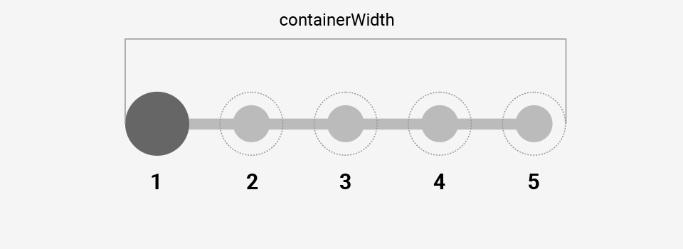
Width of the container where all the options will be rendered.
variant (optional, defaults to ‘primary’)
type: CustomSwitcherVariant = ‘primary’ | ‘secondary’
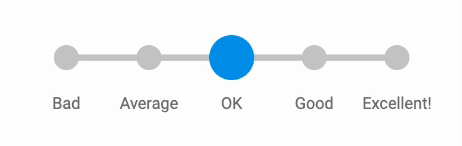
There are only two basic variants of CustomSwitcher UI. All the customizations are based on one of those variants.
The anatomy of primary variant
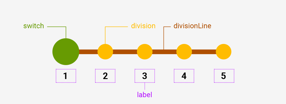
Primary variant has all the elements like switch, division line, divisions and options labels at the bottom.
Switcher is filled and background color is transitioned in case optional color properties were provided in options array.
The anatomy of secondary variant

Secondary variant has only main switch and labels at the center of divisions areas. Divisions and division line elements are hidden but this can be overridden by cssOverrides prop (see below).
Switch element is transparent but has a border. Border color is transitioned in case optional color properties were provided in options array.
switchSize (optional)
type: number
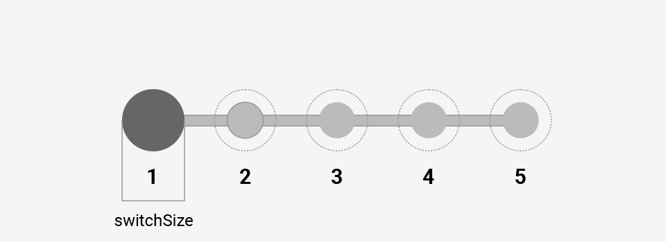
As is.
dragEnabled (optional, defaults to true)
type: boolean
You can disable drag and it can be useful in some cases, for example when using value as a controlled value.
disabled (optional, defaults to false)
type: boolean
In case you need to disable interaction with CustomSwitcher.
scaleWhileDrag (optional, defaults to true)
type: boolean | number
You can turn off scaling of switch element while dragging by providing false. Or you can define a custom scale by providing a number, e.g 1.5 will mean a 150% switch size while dragging like when using CSS scale property.
cssOverrides (optional)
type: CSSOverrides
You can pass an object of CSS overrides corresponding to this shape:
type CSSOverrides = {
  cursorDefault?: CSSProperties['cursor'];
  cursorGrab?: CSSProperties['cursor'];
  cursorGrabbing?: CSSProperties['cursor'];
  cursorDisabled?: CSSProperties['cursor'];
  switch?: CSSProperties;
  switchDisabled?: CSSProperties;
  division?: CSSProperties;
  divisionLine?: CSSProperties;
  label?: CSSProperties;
};
With this you can add and/or modify existing CSS properties of different elements and some behaviors.
callback (required)
type: (currentValue: OptionValue) => unknown
A callback which is fired when user selects an option either by using drag or just clicking on needed option.